
Customer Wallet Personalization
The wallet represents the customer’s position within the brand/benefits program.
It is displayed at different customer interaction points: the brand’s app, WhatsApp, and web access.
The content and format of the brand’s wallet, which the end user uses to interact with the business and manage their entire portfolio of benefits, is determined by three aspects:
Fixed parameters (FIXED):
There are some parameters that can be customized before compiling/publishing the apps. These variables are configured, and once the app is published in the iOS and Android stores, they cannot be modified until a new version is compiled and published. In this document, this type of information is identified with the word FIXED.
Configurable parameters (CONFIGURABLE):
There are parameters/fields that can be changed in the wallet at any time, even in the apps, without the need to upload a new version. These are fields whose modification will be carried out by Wapping’s technical team, but do not require the end user to update the app version for the changes to take effect. These fields are identified with the word CONFIGURABLE.
Editable parameters (EDITABLE):
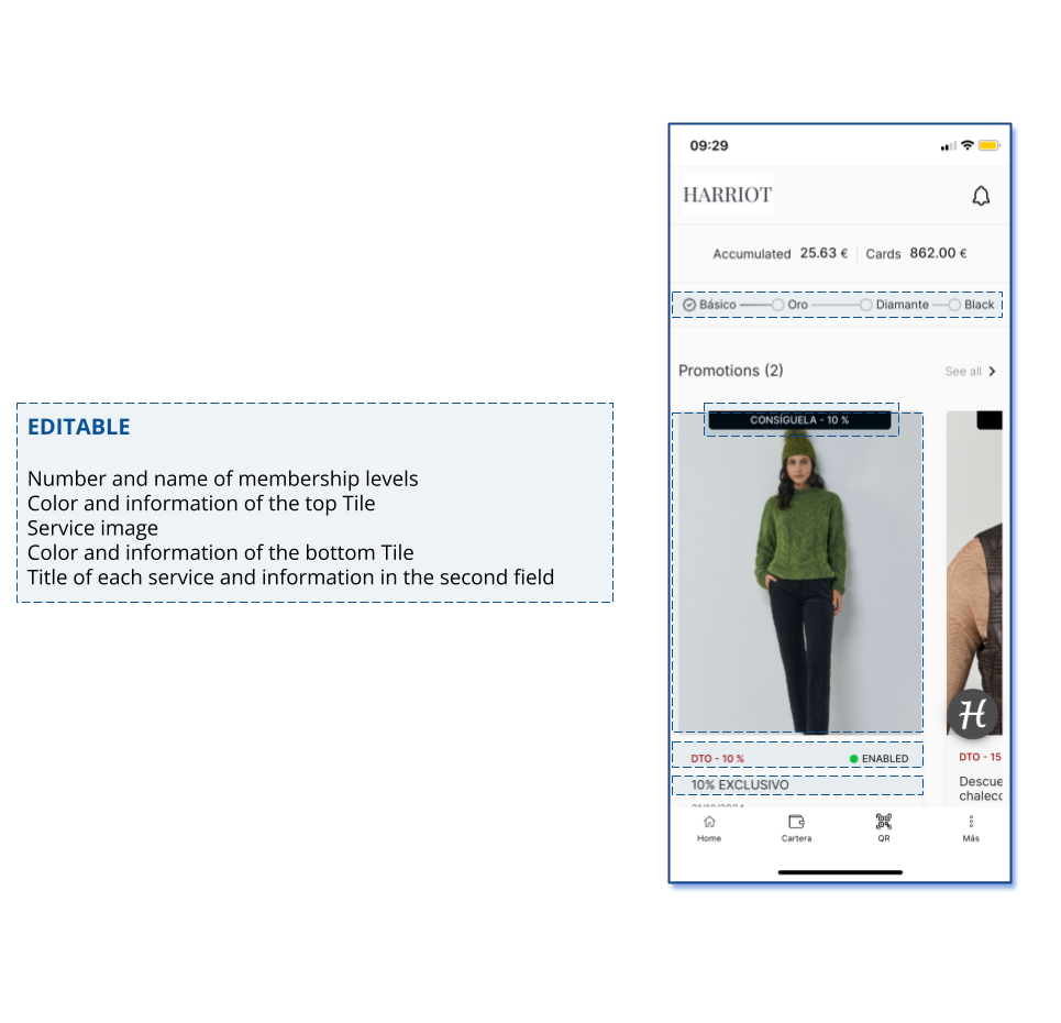
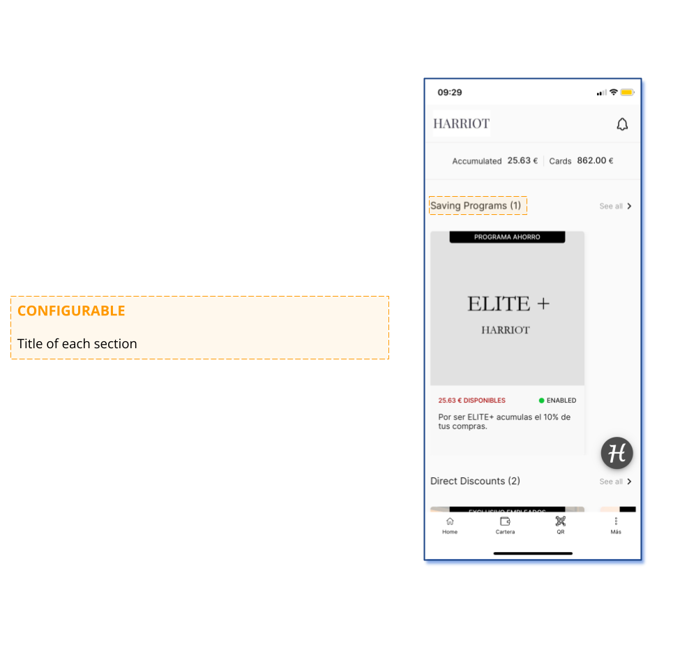
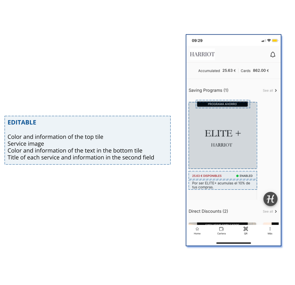
Information associated with each specific service created in Wapping Manager. For each type of service (direct discount, promotion, reward, etc.), configuration can be done during editing:
- The service’s own information (image, descriptive texts, usage condition texts, etc.).
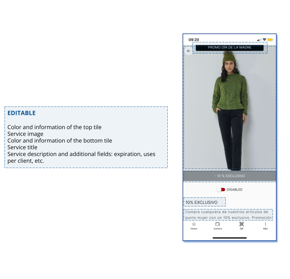
- What information will be displayed in each of its presentation fields in the client’s app. For example, promotions are shown with an image, a top tile (overlaid on the image) with certain information, and a bottom tile in the expanded view of the promotion (below the image) with additional details. You can configure which parameter will appear in each tile and the number and type of additional information fields. This configuration is done from Wapping Manager for each service type and remains predetermined (unless modified) in the presentation of the different services.
Next, the different wallet views are presented, including those exclusive to the apps, detailing for each which fields are customizable and their type.
The last section of this entry presents a table with the definitions and expected format for each FIXED and CONFIGURABLE field, which are the only ones that need to be defined during the onboarding process.
If the wallet is inserted via iframe into the client’s existing app, only the points from section 7 onward in this document will apply.
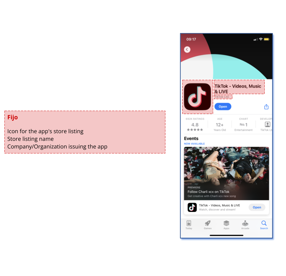
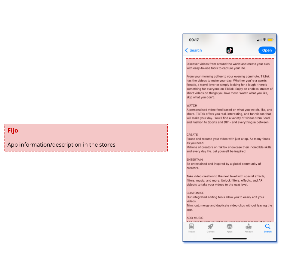
1. Presentation in the iOS and Android stores
2. Display on a mobile device home screen
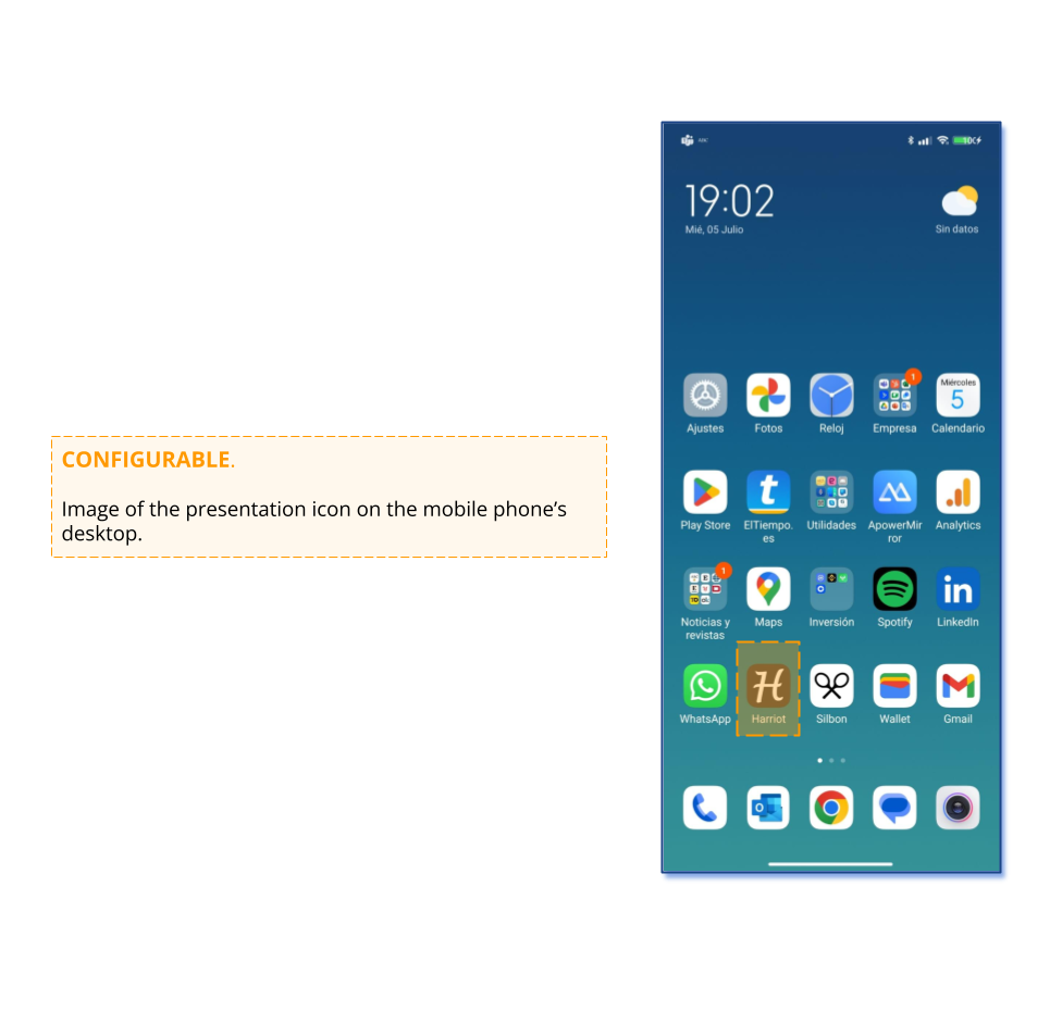
The presentation of the app on the mobile device’s home screen requires an icon, as shown below.
3. Splash
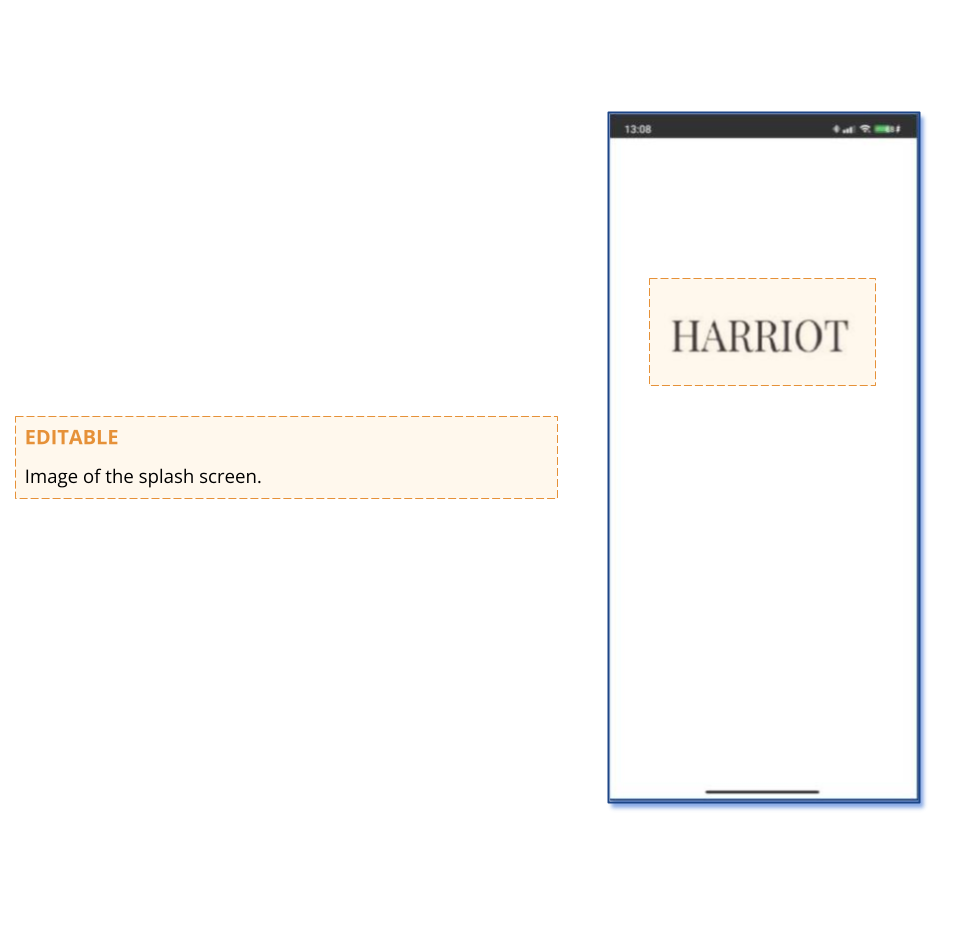
The splash screen is the image that appears at the start of the app while the data is loading and the startup screen is displayed.
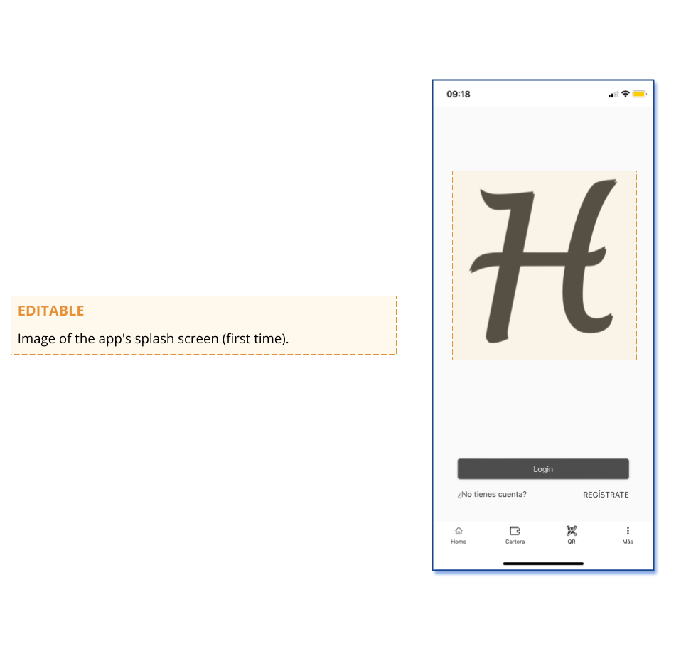
4. Startup screen view
This is the screen displayed the first time the app is launched or when returning to the login screen.
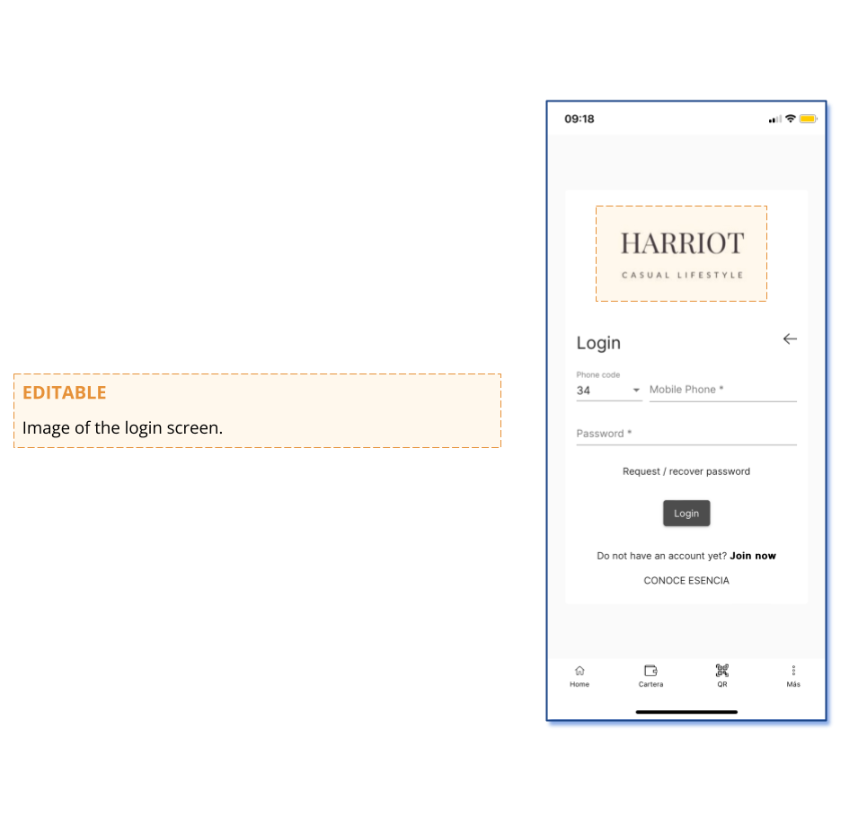
5. Login screen view
This is the view that presents the registration of a new user or the login of an already registered user.
6. Main screen view
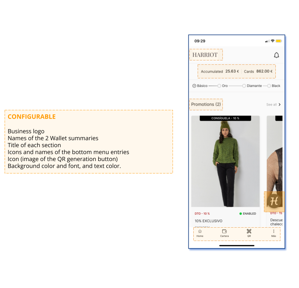
The icons and their corresponding texts in the wallet’s bottom menu (navigation bar) provide shortcuts to wallet functions. Below are the different wallet functions that can be represented as icons in the bottom menu. The maximum number of entries in this bottom bar is 5.
- Home (takes you to the eCommerce front) – Applies to the app version that embeds the brand’s eCommerce.
- Account (takes you to the user account management page of the eCommerce) – Applies to the app version that embeds the brand’s eCommerce.
- Benefits (takes you to the main wallet page where the carousels of Promotions, Rewards, Posts are displayed).
- Wallet (takes you to the page for Savings Programs, Gift Cards, etc.).
- QR (takes you to the user account management page of the eCommerce).
- Stores (opens the list and navigation of the business’s stores/branches).
- Tickets (opens the list of the customer’s digital tickets).
- How It Works / Help (takes you to the informational landing page of the benefits program).
- Notification Settings (takes you to the page that allows configuring notification permissions in the program).
- Profile (opens the user profile data configuration).
- Wallet Passes (opens the page with icons to download the Pass in Google Wallet and Apple Wallet).
- My Groups (opens the view of group memberships and the functionality to join a customer group).
If you choose the app version that embeds the brand’s eCommerce, it is recommended to use a Home icon that leads to the app front (eCommerce front) and also an Account icon that leads to the eCommerce page where the customer logs in or, if already logged in, accesses their account data.
The final icons and texts that the business wants to use are configurable and must be provided during onboarding.
7. “Wallet” View
8. Service Detail View
9. “Products” View within a Rewards Service
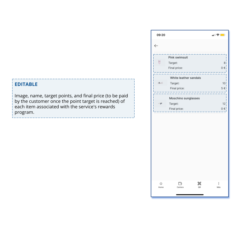
A reward can be associated with one or several products. In this case, the “Products” entry will be available and will display the product or products included in the reward. It will also show the number of “points” or “milestones” required to obtain that reward product.
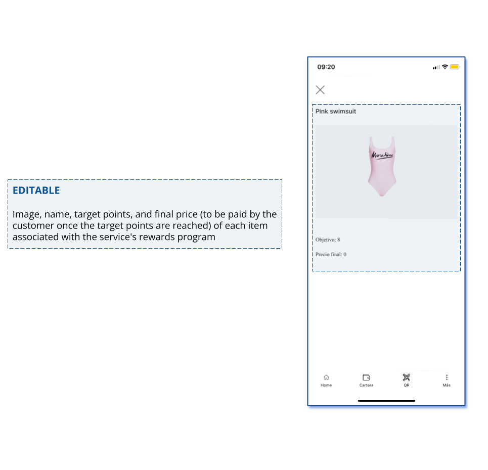
10. View of a Specific Product Associated with a Reward
A reward can be associated with one or several products. By clicking on a specific product, its detailed view will be displayed.
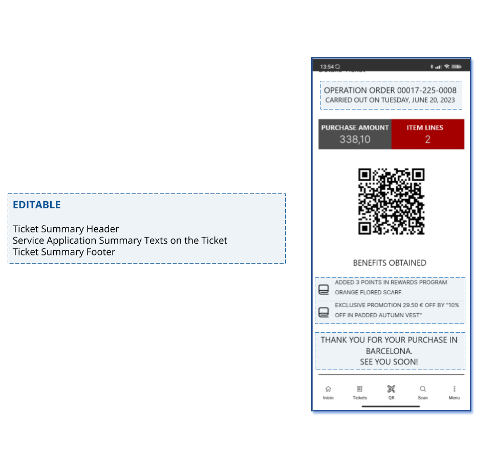
11. Ticket Summary View
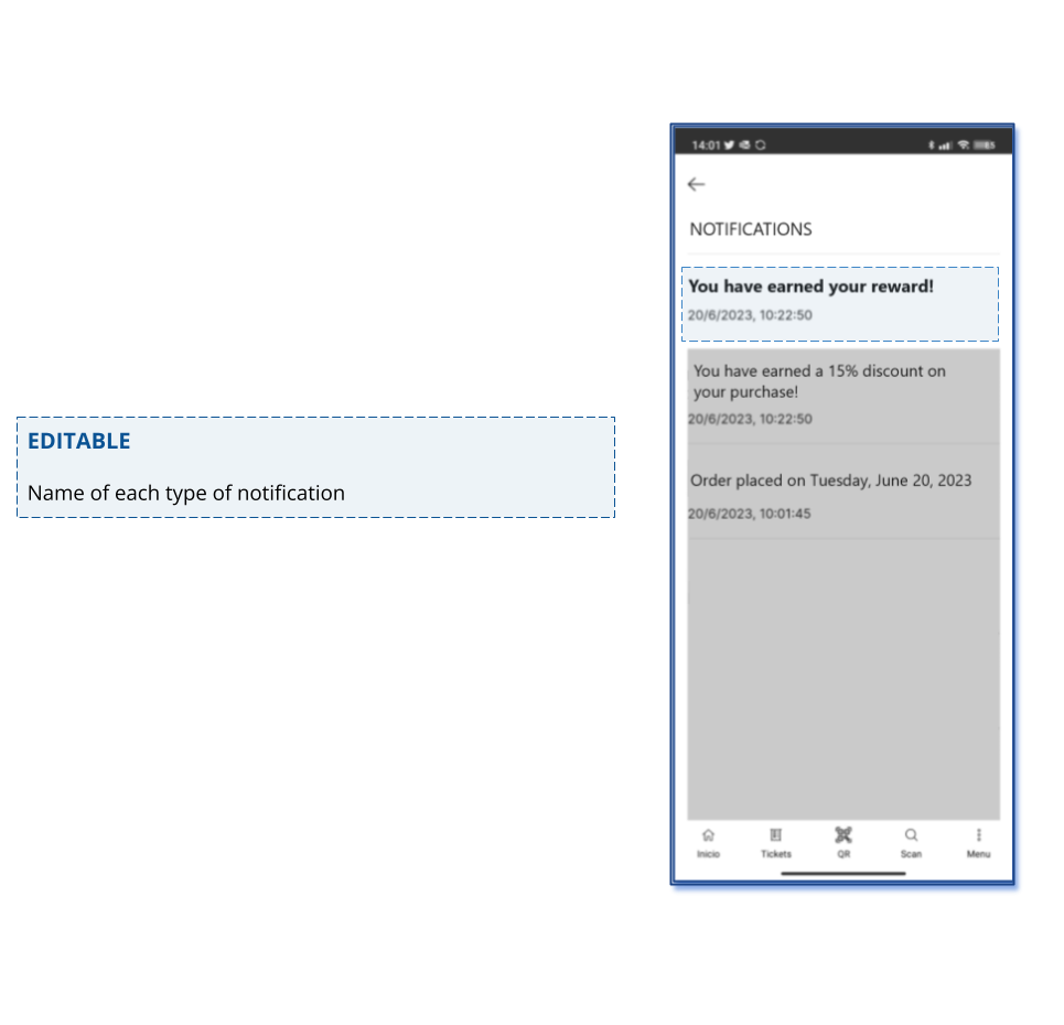
12. Notifications
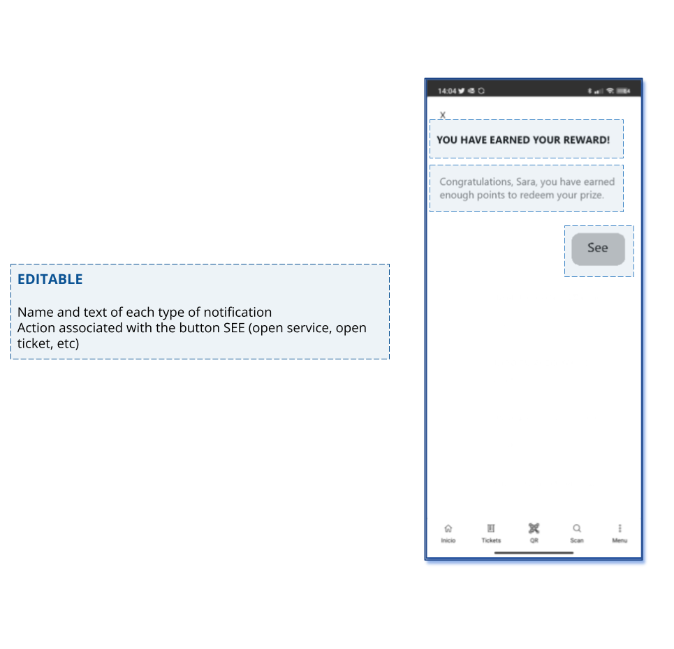
By clicking on a notification, you access its detailed view.
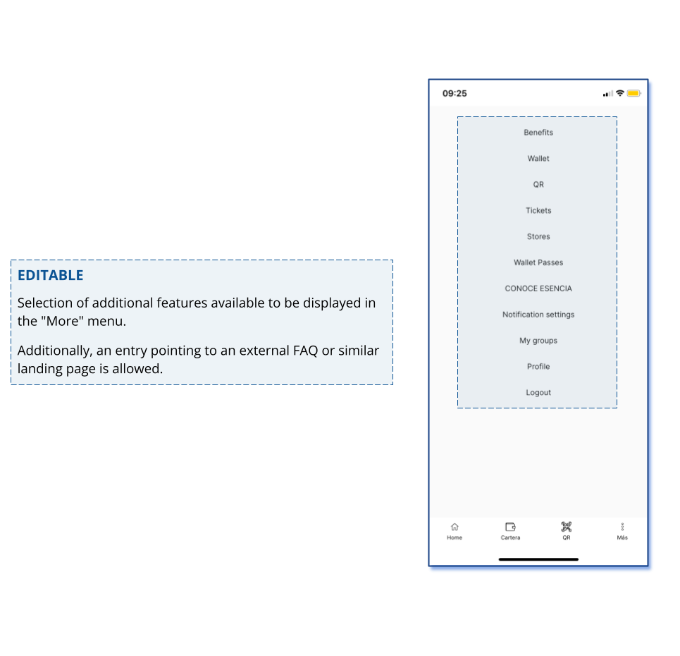
13. Last Menu Entry View
14. Fields and Information Format
Below is a summary table with the information the business must define during the onboarding process, corresponding to the fields identified with the FIJO and CONFIGURABLE labels. This table is available for download in Excel format at the following link: App Customization Information
Updated 11 months ago